Domino's Unveils First Brand Refresh in 13 Years: Focus on 'Craveability'
Domino's launches its first brand refresh in 13 years, focusing on bolder colors, new jingle, and a "Hungry for MORE" strategy to emphasize product craveability.
In a move that follows closely on the heels of its chief competitor, Domino's Pizza has announced its first comprehensive brand refresh in 13 years. The decision comes just days after Pizza Hut revealed its own global brand makeover, highlighting the intensifying competition among major QSR pizza chains. For Domino's, the refresh is not merely a cosmetic update; it is a strategic repositioning with the explicit aim to make "every aspect of the brand as craveable as what's inside the box." This overhaul is an acknowledgement that in the modern consumer landscape, the ordering experience, the packaging, and the brand identity must all contribute to the anticipation and enjoyment of the product, extending beyond the taste of the pizza itself. This long-overdue update signals a renewed focus on connecting with customers on an emotional level.
"Hungry for MORE": Shifting Focus from Tech to Taste
Driving this massive internal and external transformation is a new core business philosophy called the "Hungry for MORE" strategy. For the past decade, Domino's had successfully positioned itself as a technological innovator in the delivery space. As Kate Trumbull, Domino's executive vice president and global chief marketing officer, noted, the company "became known as a technology company that happens to sell pizza." The brand refresh, however, marks a pivot back to the fundamentals. The new strategy is designed to redirect organizational and customer focus back to "making and delivering the most delicious products and experience," recognizing this as the core driver of customer satisfaction and loyalty. By emphasizing product quality and the overall deliciousness of the meal, Domino's seeks to re-establish itself as a leading food-first brand, rather than a logistics company.
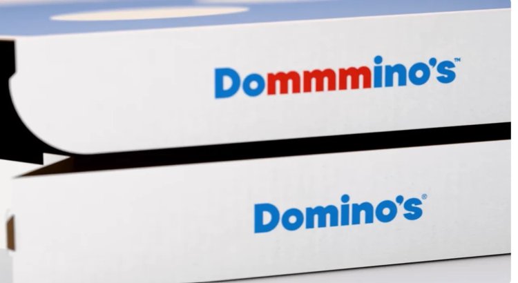
Baking "Craveability" into the Name and Ethos
The central theme of the entire campaign is craveability, which the company is attempting to literally bake into its brand identity. Instead of a traditional, easily forgettable tagline, the brand essence is encapsulated in a new, name-bending jingle, "Dommmino's," brought to life by singer-songwriter Shaboozey. This jingle is designed to be instantly hummable and memorable. The slight, playful elongation of the letter 'm' is intentional, representing the sound of delicious anticipation. As Trumbull explained, the company is integrating the concept of being craveable into "every aspect of our brand as a reminder of this relentless focus," noting that "You literally can't say 'Domino's' without saying 'mmm'" when utilizing the jingle. This is a subtle yet effective linguistic and auditory mnemonic device intended to prime the customer for the enjoyment of the pizza.
The Visual and Auditory Overhaul
The refresh involves a comprehensive redesign of the brand’s aesthetic and auditory elements to communicate its renewed focus on flavor and excitement. Visually, the makeover introduces a palette of "hotter, more delicious colours," moving away from any staid or dated elements to convey energy and warmth. This is paired with a bolder typeface and graphics to establish a more confident and contemporary look. The packaging—a crucial touchpoint for a delivery-focused business—has been updated to be brighter, reinforcing the message of a fresh and exciting experience upon arrival. The new sound design, including the infectious "Dommmino's" jingle, is meant to make customers "hum along to familiar hits," creating a sense of joy and comfort associated with the ordering process.
Comprehensive Global Rollout Across All Touchpoints
The new branding is not confined to a single market or a specific medium; it represents a comprehensive, multi-year global rollout. The refreshed look and feel will be adopted across the U.S. and multiple international markets over the coming months, ensuring brand consistency worldwide. Every interaction point a customer has with Domino's will be updated to reflect the new identity. This includes mass communication channels like TV and digital advertising, the dominos.com website, and the Domino’s ordering app. Furthermore, physical touchpoints are also being transformed, including packaging boxes, print materials, in-store graphics at franchise locations, and the new design even extends to team member gear, ensuring that every facet of the brand reinforces the new "Hungry for MORE" message.
A Refresh from a Position of Strength, Not Struggle
Unlike many companies that undertake a major rebranding effort as a desperate measure to reverse declining fortunes, Domino's frames this refresh as a proactive, strategic push from a position of power. Kate Trumbull pointed out that "Most companies rebrand themselves when they're struggling," but emphasized that for Domino's, after years of "category-defying growth," the refresh is fundamentally about "continuing to push to be the best version of ourselves." This narrative positions the company as confident and forward-thinking, investing in its future success rather than reacting to current failures. It’s an investment in elevating a successful brand to an even higher standard, ensuring that Domino's maintains its competitive edge and market leadership well into the next decade.