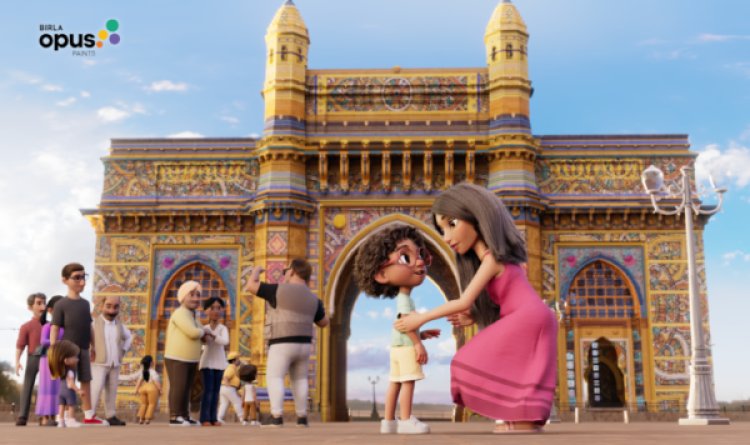
Birla Opus Paints Celebrates Home Colour And Togetherness In New Film
Birla Opus Paints’ latest ad celebrates togetherness through vibrant colours, showcasing how shared spaces and emotional connections shape home life while reflecting the spirit of festive renewal.
Birla Opus Paints has rolled out a new advertising campaign that does more than showcase colour swatches. The brand’s latest film explores the deeper emotional layers of home life, using colour as a visual metaphor for unity, celebration and shared memories. In a narrative that feels both familiar and uplifting, Birla Opus positions its paints as quiet enablers of togetherness rather than mere decoration.
The campaign centres on the idea that colour has the power to reflect emotion, mood and human connection. Rather than presenting a hard-sell product message, the film creates a tapestry of moments where colour becomes synonymous with warmth, harmony and community. It paints (no pun intended) home life as a dynamic experience where personalities intertwine, laughter lingers and memories are coloured by warmth.
Set within a residential neighbourhood, the ad traces multiple storylines that intersect through everyday activities. Families interact in courtyards, neighbours share snacks on verandahs, children play while elders watch on with content smiles. Against this tapestry of shared life, Birla Opus introduces colour not as an aesthetic afterthought but as a central theme that enhances the visual and emotional experience of home.
What makes the campaign engaging is its focus on emotional realism rather than glamorous staging. The scenes feel like snapshots from real lives — unfiltered and relatable. You see a couple deciding on a new colour for their living room, friends painting a common wall together, and siblings laughing over unexpected paint splatters. These moments are uncomplicated but rich with human connection.
Colour plays a symbolic role throughout the narrative. Warm hues signify celebration and laughter, cool tones evoke calm and reflection, and vibrant shades underline moments of joy and togetherness. It’s a visual lexicon that elevates everyday life into something that feels festive without relying on traditional festival imagery or clichés.
The tagline at the heart of the communication reinforces this idea — home is where colours and connections blend. Birla Opus Paints becomes more than a brand; it becomes a backdrop for shared experiences. The ad suggests that while architecture shapes a house, colour shapes the emotional atmosphere of home life.
Visually, the campaign uses a balanced palette that feels warm yet contemporary. Sweeping shots of colour matching conversations are interspersed with close ups of expressive faces, laughter and spontaneous interactions. The editing rhythm mirrors the ebb and flow of domestic life — quiet reflection followed by bursts of activity and celebration.
The campaign also subtly reflects aspirational living without feeling out of reach. It avoids overly polished visual narratives, opting instead for scenes that feel lived in and warmly imperfect. That choice makes the storytelling feel grounded and inclusive.
Birla Opus Paints appears to be aiming at a broader cultural insight. In many homes, colour is one of the first ways families express personality and mood. A fresh coat of paint often signals a new beginning, a changed perspective or a season of joy. By celebrating this emotional aspect, the campaign elevates its communication from functional product promise to emotional resonance.
Another noteworthy aspect is how the campaign captures the idea of home as a collective space. Shared walls, common courtyards and laughing gatherings remind viewers that home goes beyond bricks and furniture. It’s where memories are made, stories unfold and every shade holds meaning.
In terms of brand strategy, the campaign helps Birla Opus Paints strengthen emotional affinity with consumers. It positions the brand as someone who understands the subtle emotional triggers tied to home life rather than just selling paint. This approach feels particularly relevant in a marketplace where product differentiation is narrowing and emotional connection becomes a key brand differentiator.
The film is set to run across television and digital platforms, tapping into festive season viewership and social engagement. Its warm narrative and relatable scenes are likely to resonate across age groups, especially among those who see home as the centre of life’s most meaningful moments.
Early reactions suggest that audiences appreciate how the ad celebrates simple joys without resorting to hyperbole. People find themselves recognising familiar scenes, shared jokes and the small dramas of daily life played out against colourful backdrops. In short, the campaign feels shared because it reflects shared experiences.
With this latest campaign, Birla Opus Paints has used colour not just to beautify walls but to highlight the emotional architecture of home life. It captures the idea that togetherness, much like colour, enhances every corner of a home — and often leaves the most memorable hues in the heart.