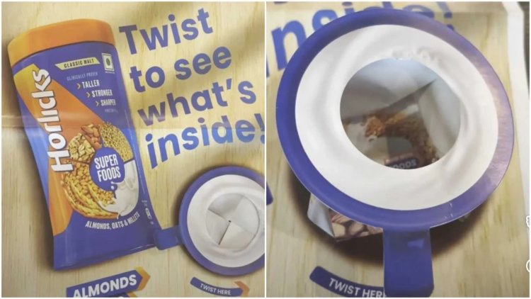
In an imaginative print innovation, Horlicks introduced a newspaper advertisement that turned an ordinary reading ritual into a playful interactive experience. Instead of a regular ad spread, readers encountered a specially designed four page pull out that transformed into a three dimensional paper cup when unfolded.
The design allowed readers to twist and expand the page, creating a life sized cup structure complete with a handle. What began as a flat newspaper page suddenly turned into a physical object that resembled a steaming cup of the health drink. For many readers, the moment felt less like encountering an advertisement and more like discovering a clever morning surprise.
The campaign was created in collaboration with the Times Innovation Lab and appeared in the morning edition of The Times of India. The idea was simple yet striking make the product literally jump out of the newspaper.
At a time when most advertising lives on phone screens and social media feeds, such tactile print ideas stand out precisely because they are unexpected. While digital ads are often scrolled past in seconds, a paper structure that unfolds into a cup demands curiosity and engagement.
But the creative execution was not just about visual novelty. The advertisement also served as a storytelling platform for Horlicks’ evolving product narrative. The campaign highlighted the drink’s updated formula and focused on the nutritional ingredients that go into every serving.
The messaging emphasised a blend of ingredients including almonds, oats, millets, and malted barley. These additions reflect the brand’s effort to align with modern nutrition conversations where consumers are increasingly aware of what goes into their food and beverages.
Another key message of the campaign was the absence of added sugar and artificial sweeteners in the product formulation. As health conscious consumers pay closer attention to ingredient labels, brands across categories are working harder to communicate transparency and nutritional benefits.
For Horlicks, the campaign represents a shift in how the brand speaks to today’s audience. The product has long been associated with its famous promise of helping children become “taller, stronger, sharper,” a line that defined the health drink category for decades.
However, changing consumer expectations mean that brands must now explain the science and ingredients behind their claims. The interactive newspaper format allowed Horlicks to communicate this updated story in a way that felt engaging rather than overly technical.
Beyond the product narrative, the campaign also highlights how print media continues to reinvent itself. While digital advertising dominates marketing conversations, print still offers unique possibilities when creativity meets physical design.
An ad that can be folded, twisted, and transformed creates a level of interaction that screens simply cannot replicate. It turns the act of reading into an experience.
For readers in Chennai and Kochi, the campaign added a small moment of delight to the morning routine. Instead of merely reading about breakfast, they found themselves unfolding one.
In a media environment where brands compete fiercely for attention, sometimes the most memorable ideas are those that break the expected format.
With a simple twist of paper engineering and a familiar breakfast drink, Horlicks managed to do exactly that making the morning newspaper feel a little more interactive, and perhaps a little more fun.