Lamborghini Unveils New Logo in Ambitious Brand Transformation
Lamborghini introduces a new logo after over two decades as part of its transformation initiative called 'Direzione Cor Tauri' for a refreshed identity
 Sumit Rawat
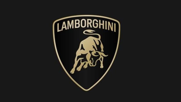
Luxury car manufacturer Lamborghini has debuted a revamped logo after over two decades, signaling a strategic pivot towards its core values of bravery, unpredictability, and authenticity.
Dubbed "Direzione Cor Tauri," this transformation initiative not only aims to realign Lamborghini's visual identity but also underscores its commitment to sustainability and carbon neutrality. Embracing the mantra of "Driving Humans Beyond," Lamborghini seeks to inspire innovation while surpassing conventional norms and limitations.
The redesigned logo features a broader Lamborghini typeface in black and white, with accents of yellow and gold, symbolizing the brand's distinct identity and premium status. Notably, the iconic bull emblem now stands independently, signifying Lamborghini's prominence in the automotive industry.
Beyond the logo, Lamborghini introduces an official typeface and a set of icons designed to mirror the company's sleek aesthetic. This cohesive visual language will be employed across all digital platforms, further solidifying Lamborghini's brand image.
View this post on Instagram
Despite the company's strategic rationale, the internet's response to the logo change has been lukewarm. Critics argue that the simplified design cheapens Lamborghini's prestigious image, with some suggesting that the old logo was superior. This sentiment echoes previous controversies surrounding logo redesigns by other major brands.
In response to online feedback, Lamborghini remains resolute in its commitment to innovation and adaptation. The logo overhaul represents a pivotal moment in Lamborghini's evolution, reflecting its unwavering determination to thrive in an ever-changing market landscape.