Google Unveils Fresh “G” Icon in First Redesign in a Decade
Google rolls out its first “G” logo update since 2015—softening edges, boosting contrast, and optimizing legibility across light and dark modes for modern interfaces.
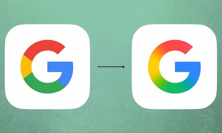
A Subtle Evolution
On May 13, Google quietly introduced a revamped “G” icon—the first since its colored “G” debuted in 2015. The new glyph refines the letterform with slightly thicker strokes, increased corner rounding, and enhanced color contrast, ensuring the icon pops on both monochrome and colorful backgrounds.
Design Drivers
Google’s update addresses modern usage patterns: from adaptive light/dark theming on Android and iOS to micro-app icons on Chromebooks and wearables. The refreshed proportions and pigment adjustments improve accessibility and brand consistency across tiny app trays and giant digital billboards alike.
Designer Commentary
Google’s in-house design lead explained that the tweak preserves the familiar four-color palette—blue, red, yellow, green—while fine-tuning geometry for on-pixel crispness. The result is an icon that feels both nostalgically recognizable and freshly tuned for 4K and foldable displays.
Rolling Out Gradually
The new “G” begins appearing in upcoming Play Store and Search app updates, with a full rollout across Google’s 160+ consumer-facing apps planned by year-end. Early developer previews confirm seamless backward compatibility within Android’s adaptive icon framework.
Branding Takeaway
Even subtle logo evolutions can signal brand vitality when grounded in practical UI improvements. Google’s refresh underscores how legacy symbols benefit from periodic retuning—balancing heritage with the demands of ever-evolving screen ecosystems.