Appy Fizz updates its brand image
 Sumit Rawat
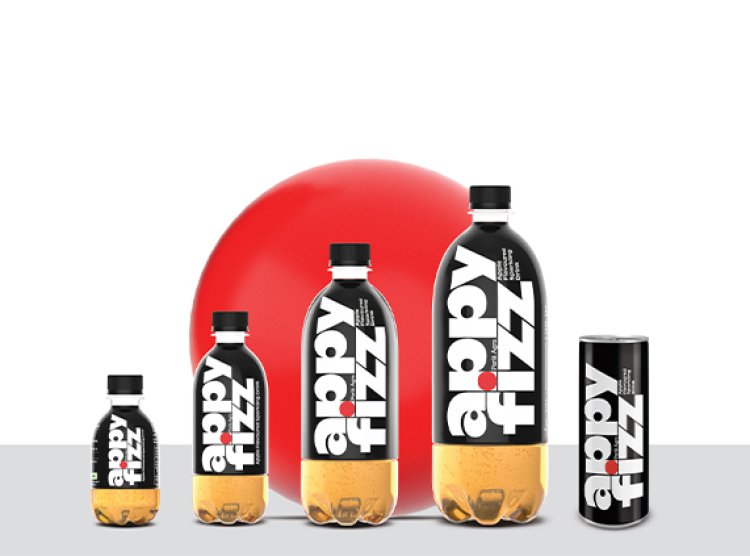
The fruit-flavored beverage Appy Fizz from Parle Agro has unveiled its new label.
The firm's logo features eye-catching, modern writing that contrasts the traditional brand colors of red, white, and black. According to the firm, "Appy Fizz's fresh packaging creates a dramatic statement ready to be clutter breaking."
The joint managing director and chief marketing officer of Parle Agro, Nadia Chauhan, has stressed Appy Fizz's distinctive position as a statement-making beverage with a history of maintaining a strong and remarkable character. Despite being the source of many identical drinks on the market, Appy Fizz stands out for its superior originality and quality.
Parle Agro wants to highlight Appy Fizz's great quality through the brand redesign and give the effervescent fruit-flavored drink category a disruptive new style, ushering in a new era of growth and disruption. The company wants to improve the Appy Fizz experience even more and keep its position as the industry's top innovator.
Pentagram developed and designed the new packaging. Harry Pearce, Partner at Pentagram Design Ltd., commented on the new look, saying, "The key goal for the Appy Fizz design was to modernize and to create a more visually arresting identity and bottle form taking the brand away from the enormous number of copycats. We changed the emphasis, giving the words "Appy" and "Fizz" equal prominence, and we used a unique font with unique components. With a hint to the apple in the red dot, the design preserves the brand equity invested in black, white, and red.