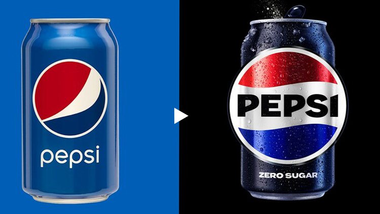
After 15 years, Pepsi introduces a new logo.

Pepsi, a beverage company, has launched a new logo. The company has undergone its first makeover since 2008. In North American markets this year and throughout the rest of the world in 2024, the new logo will be introduced.
The new look, which will be used on the brand's digital and physical properties, including packaging, fountain and cooling equipment, fleet, apparel, and dining, reflects the company's evolving identity. The brand's 1987–1997 logo is quite similar to the updated design.
To differentiate it from its 90s logo, the most recent version features a new typeface, color, and border. The new logo differentiates from its 2008 iteration by using upper case letters and more vibrant, vivid colors. The brand's usage of a black border and text is a nod to the black can of Pepsi Zero. The can has a distinctive silhouette as well.
The refreshed look also supports the beverage company's goal of promoting its zero-sugar promise. According to CEO Ramon Laguarta, "Zero is going to be the center of the strategy for the Pepsi brand."

 Sumit Rawat


