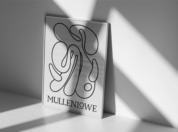
MullenLowe creates a new brand identity

MullenLowe has announced its new global brand and revamped positioning, which were designed to unify the network across 57 regions and differentiate it from competition. According to MullenLowe, the octopus has evolved from an operational mascot to a kindred spirit who graphically reflects how brands must grow today.
According to studies, innovative brands grow at double the rate of their competitors, while brands that continue to innovate grow seven times faster.
"Our icon is the ideal metaphor." Because of its adaptability and fluidity, the octopus has persisted for almost 300 million years. It is the only organism that self-edits its own DNA on a regular basis—a blueprint for how brands should act today," explains Kristen Cavallo, CEO of MullenLowe Global.
MullenLowe U.S. produced the new brand identity, which was led by Joo Paz, head of design.
"We want to challenge the way brands present themselves in the world." Our octopus isn't afraid of change since it's in its DNA. "We embraced that with a fully generative identity that was designed to demonstrate personalization at scale," adds Paz.
The new logo does not follow logical rules. It defies all forms of symmetry and rigidity. It alters, moves, and behaves differently since it has no corners or end points. "Our octopus is alive and well." It has a will, a personality, and most importantly, it wants to move. It has the flexibility to remake itself eternally with its countless twists and turns," Paz adds.
MullenLowe encourages its worldwide workforce of over 4,000 people to create their own octopus utilizing a generative app. "We want the design system to reflect who we are and give everyone at MullenLowe the opportunity to make their own mark," explains Paz. The octopus may be customized for email signatures, social and profile icons, and even the background of an Apple Watch.
The effervescent octopus is coupled with a custom wordmark that is stark, dependable, and firm in its logical Serif approach. It grounds the octopus' wackiness by fusing emotion and logic. While the octopus embraces the new, the wordmark honors the past and the agency's lengthy history.
A pattern was devised to signify inclusivity and the coming together of all the unique expressions and people that make up MullenLowe, in addition to all the separate iterations.
The system features its own unique typographic treatment to round out the visual identity. The octopus' tentacles change into letters and numbers, forming a complete typeface from A to Z and 0 to 9.
The new identity has been implemented throughout all of the agency's communication touchpoints, including its website and social media. It will be plastered on office walls and accompanied by much-anticipated swag. Beyond design, the new appearance instills newfound enthusiasm, pride, and confidence in the network's next chapter.
"This is more than just a new logo." We believe in the growth of brands, and we designed our identity and voice to reflect that idea. More of the same is not the way to long-term success in a quickly changing environment. "Brands must earn and constantly defend their disproportionate share of attention," argues Cavallo. "Products can be boring, but brands can never be."

 Sumit Rawat


