Instagram Refreshes Its Wordmark Logo After 10 Years
Instagram refreshes its wordmark after 10 years, introducing sharper, redrawn lettering while keeping its familiar script style.
 SociapaHQ
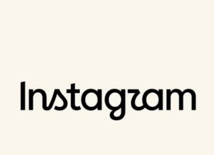
Instagram has launched a new version of its wordmark logo, changing the lettering for the first time in a decade.
Instagram boss Adam Mosseri announced the change on Instagram and Threads, calling the new wordmark “sharper and more modern” while retaining nods to the platform’s original design and a focus on simplicity.
The new logo retains the familiar script font style of Instagram but with redesigned letterforms.
Instagram Gets A Wordmark Refresh
This is the first major change to Instagram’s wordmark since 2016. That year, the platform ditched its brown camera icon with a rainbow stripe for the colourful pink-gradient icon still in use today.
The last time the wordmark at the top of the app was changed was 10 years ago, Mosseri said, so the latest tweak was a long overdue refresh.
The new design is intended to be cleaner and more modern, but also retains elements of the original Instagram look and feel.
Mixed Reactions Online
The new design has sparked a mixed response online. While some users appreciated the new typography, other users criticised the change.
A number of users also joked that the new lettering makes Instagram look like it reads “Instagzam”, with the shape of the redesigned “r” becoming a particular talking point.
The wordmark refresh comes as Instagram continues to improve its visual identity while still keeping the core of what the branding users have gotten used to over the years.